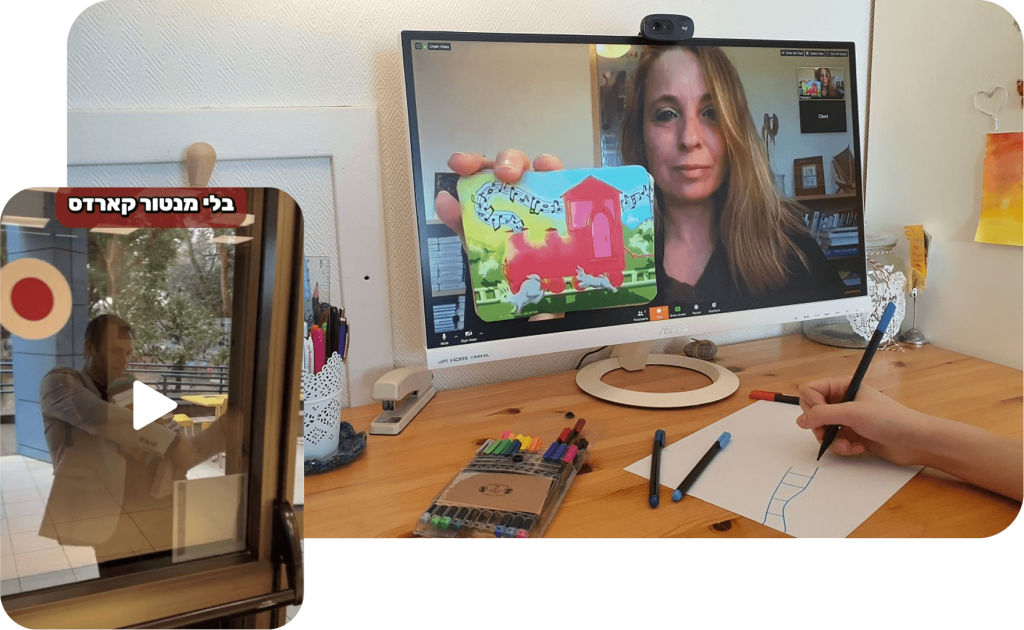
Watch the Story: For a more detailed look at the challenge and the results, check out this video case study where I walk through the transformation of the Mentor Cards platform.
The Impact (TL;DR)
Business Results: Doubled the startup’s annual revenue in less than a year.
User Engagement: Significant increase in the usage of "Guidance Manuals" and expert content.
Retention: Improved long-term retention by personalizing the user experience and history.
Operational Efficiency: Drastic reduction in customer support tickets regarding platform navigation.
The Challenge: A Product Frozen in Time
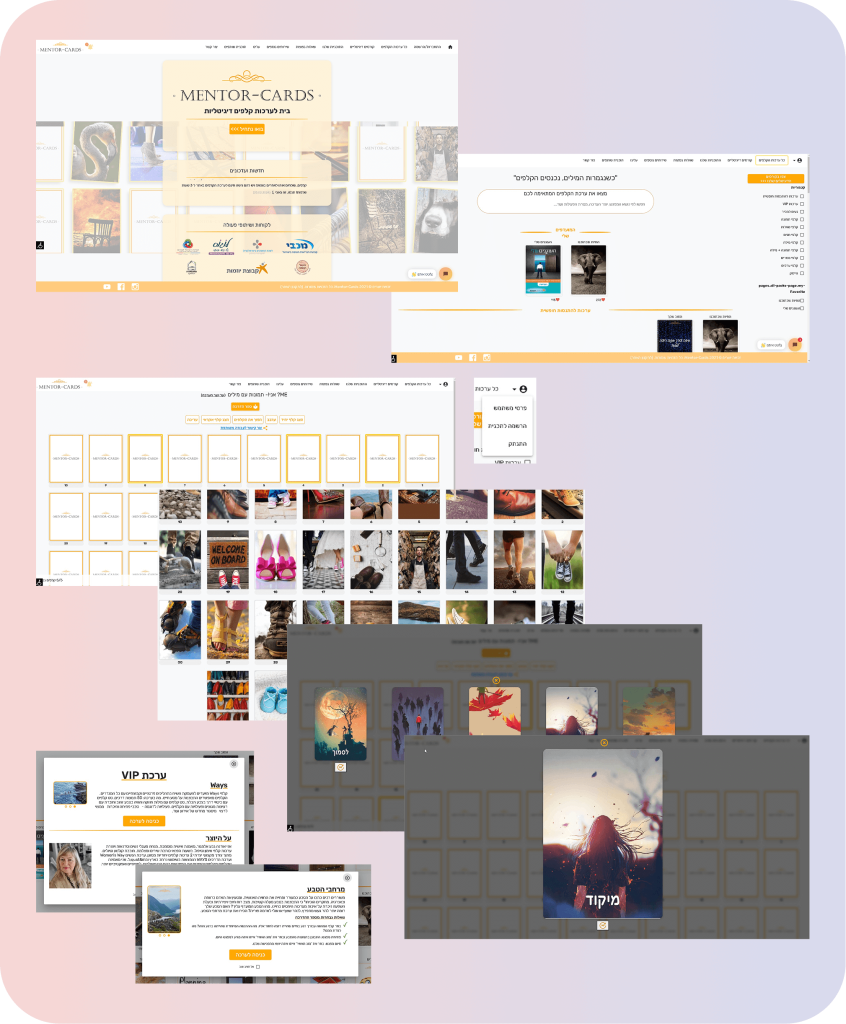
Mentor Cards was born during the COVID-19 pandemic to bring therapeutic card decks into the digital space. However, the platform had never undergone professional design:
Visual Debt: The UI was cluttered, outdated, and confusing for the core audience (older therapists and mentors).
Choice Paralysis: Users were overwhelmed by dozens of card decks with no clear logic or categorization.
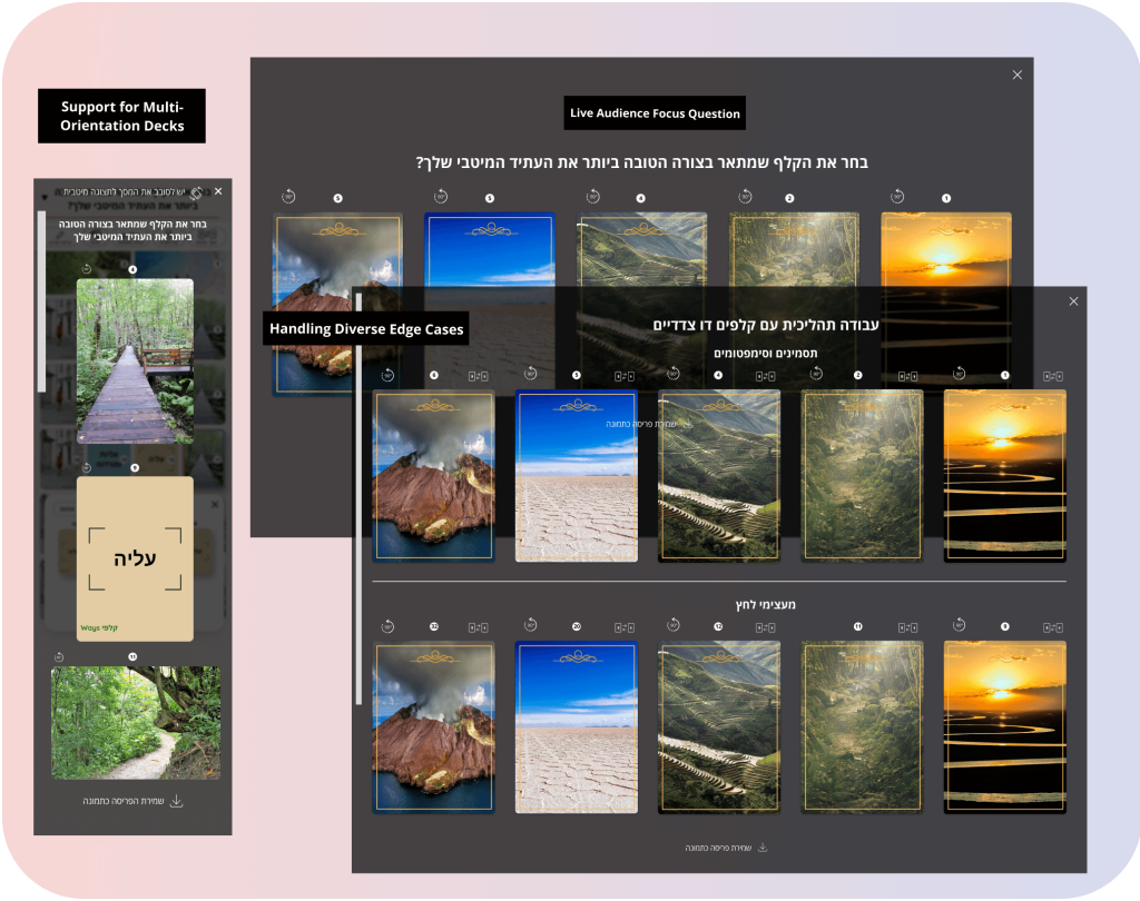
Technical Constraints: The system could not support various card orientations (Portrait/Landscape), limiting content variety.
The Strategic Solution: Storytelling Through UX
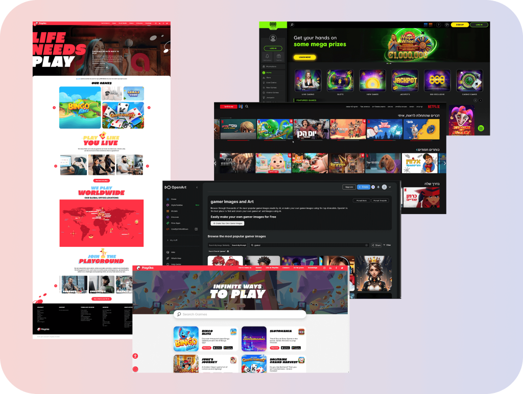
Since there were no direct competitors, I drew inspiration from Netflix and Spotify to create a familiar, content-first experience:
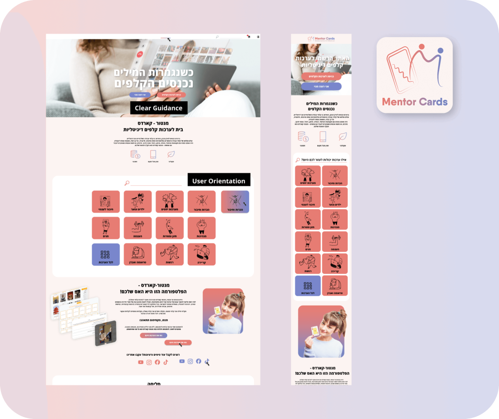
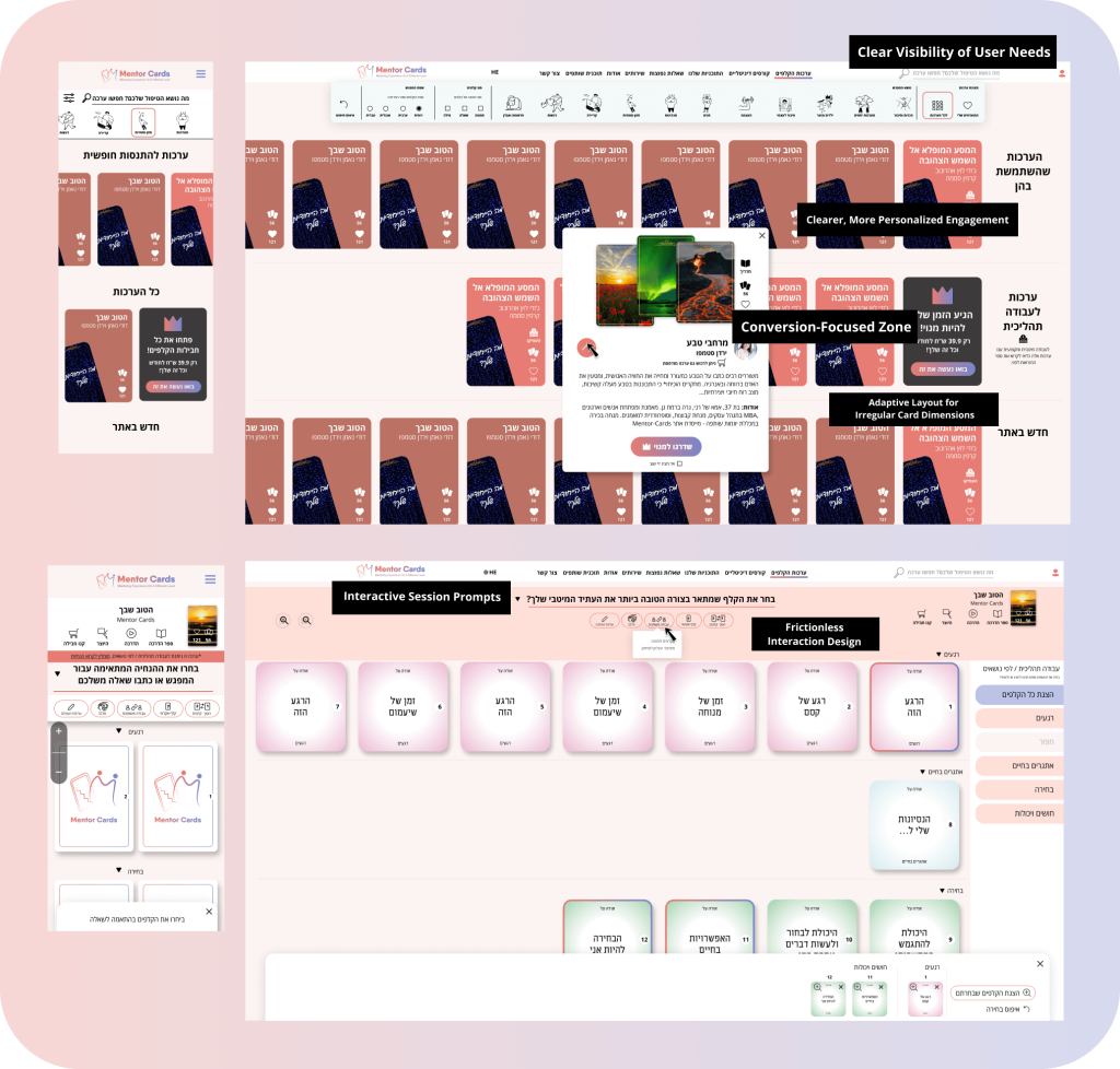
Topic-Based Filtering: I collaborated with the founders to create a taxonomy that helps mentors find the right deck for their session (e.g., "Group Therapy", "Self-Discovery") in seconds.
Interactive Guidance: We transformed dry Word-based instructions into engaging, visual guides that teach users how to facilitate a session effectively.
The "In-Session" Feature: Added a unique "Question Overlay" feature that keeps the focus during live sessions, a pain point identified during research.
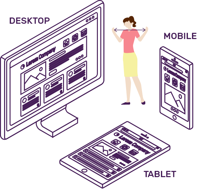
Responsive Card Engine: Designed a flexible interface that beautifully accommodates any card ratio, allowing the platform to scale its content library.
The High-Level Process
Discovery: Analyzed support logs to identify where users were getting stuck.
Strategic Audit: Mapped the transition from "Old System" logic to a modern, scalable architecture.
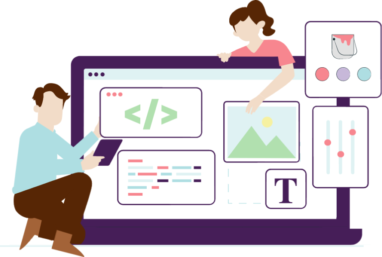
UI/UX Redesign: A complete "Makeover" of the branding, web, and system interface.
Design System Implementation: Built a robust component library to ensure consistency across the dashboard and mobile app.
Final Results
The startup doubled its income, Feedback on visibility and navigation has been excellent
By focusing on the value of the cards rather than just the digital tool, we helped therapists feel confident and professional, turning a "COVID-19 solution" into a thriving, profitable business.
הגיע הזמן לשדרג את חוויית המשתמש במוצר שלך?
אני כאן בשבילך, רק צריך למלא כאן כמה פרטים וחוזרת אליך 🤙🏻

















![[object Object]](https://shirleygueta.wpadmin.co/wp-content/uploads/2026/04/image-1775330012980.png)